Every year, Color of the Year announcements spark a lot of conversation. And for good reason. They offer insight into where interior design is headed. But they’re often misunderstood as rules instead of signals.
As we look ahead to 2026, the biggest takeaway isn’t which paint colors are being highlighted. It’s why those colors keep showing up and what they tell us about how people want their homes to feel, inside and out.
If you’re planning a new home or
exploring house plans, here’s how to use 2026 color trends as inspiration, without boxing yourself into a specific palette.
What 2026 Color Trends Actually Tell Us
A recent industry roundup makes one thing clear: 2026 design is leaning warmer, moodier, and more grounded. This perspective reflects insights highlighted by
NAHB and across the broader design industry.
Designers and homeowners alike are gravitating toward spaces that feel balanced, calm, and flexible. These are spaces that can adapt over time instead of chasing short-term trends. That shift has less to do with paint and more about how homes are designed and used day to day.
Why Warm Neutrals Continue to Anchor Modern Design
Cool grays have been stepping aside for a while now, and 2026 reinforces what we’re already seeing in residential design: warmer neutrals are here to stay. These tones work especially well in:
Open, connected living spaces
Homes with abundant natural light
Floor plans designed for visual continuity across rooms
Warm neutrals don’t compete with the architecture. They support it. They let materials like wood floors, cabinetry, stone, and exterior finishes take the lead. They also make it easier to change décor over time without rethinking the entire home.
These warmer palettes also tend to show up through texture, not just color. Layered materials, subtle pattern, and surface variation add depth without overwhelming the space.
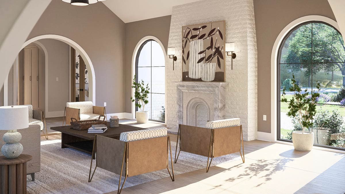
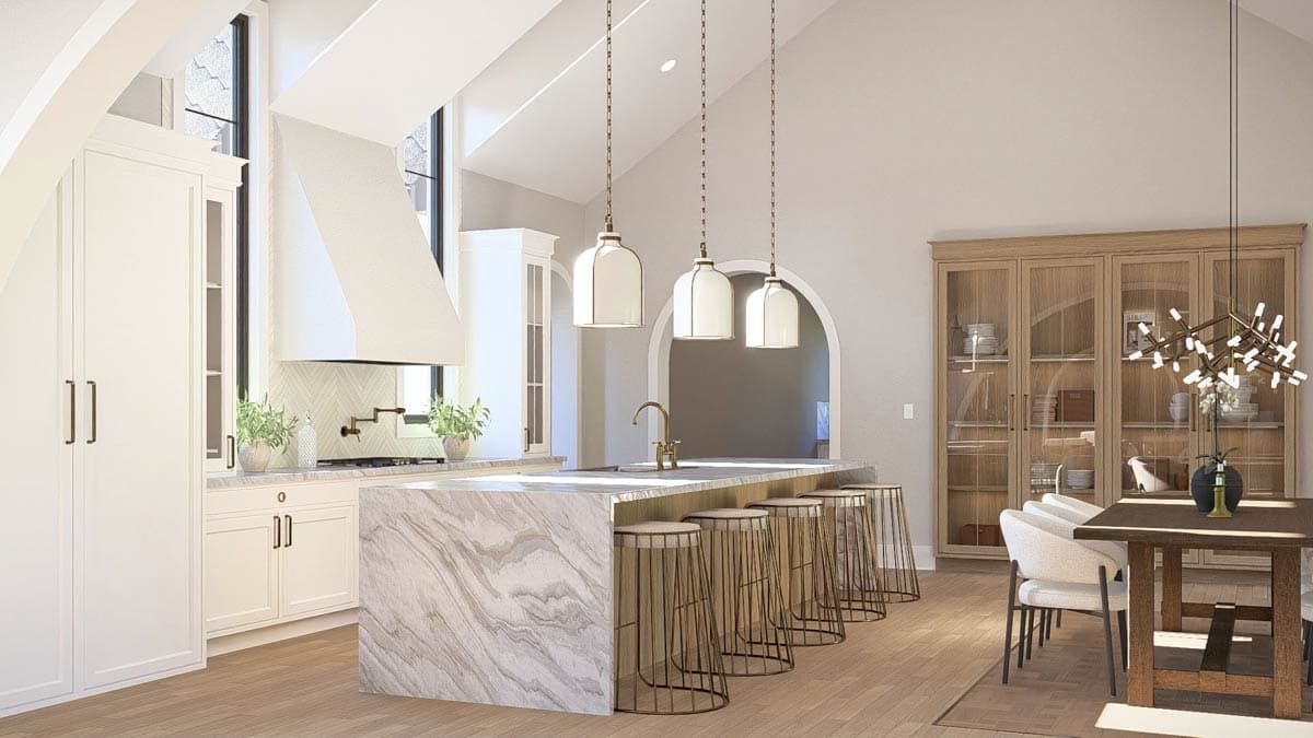
This kind of neutral foundation creates consistency across living, kitchen, and dining spaces, even when adjacent areas use slightly different tones. In Plan 623568DJ, those spaces sit side by side and flow naturally, with subtle color shifts that feel cohesive rather than disconnected. To see how this approach carries through the rest of the home, you can view the full plan below.
Loading plan...
Where Richer, Deeper Colors Fit Best
While light, warm backdrops dominate, deeper hues still play an important role. They’re simply being used in more intentional ways.
Rather than covering entire homes, richer tones tend to appear in more focused ways. They’re often used to
add depth to built-ins or cabinetry, create contrast on interior doors, trim, or select exterior details, or bring definition to spaces like studies, dining rooms, primary suites, or other focal areas. This approach pairs especially well with plans that include:
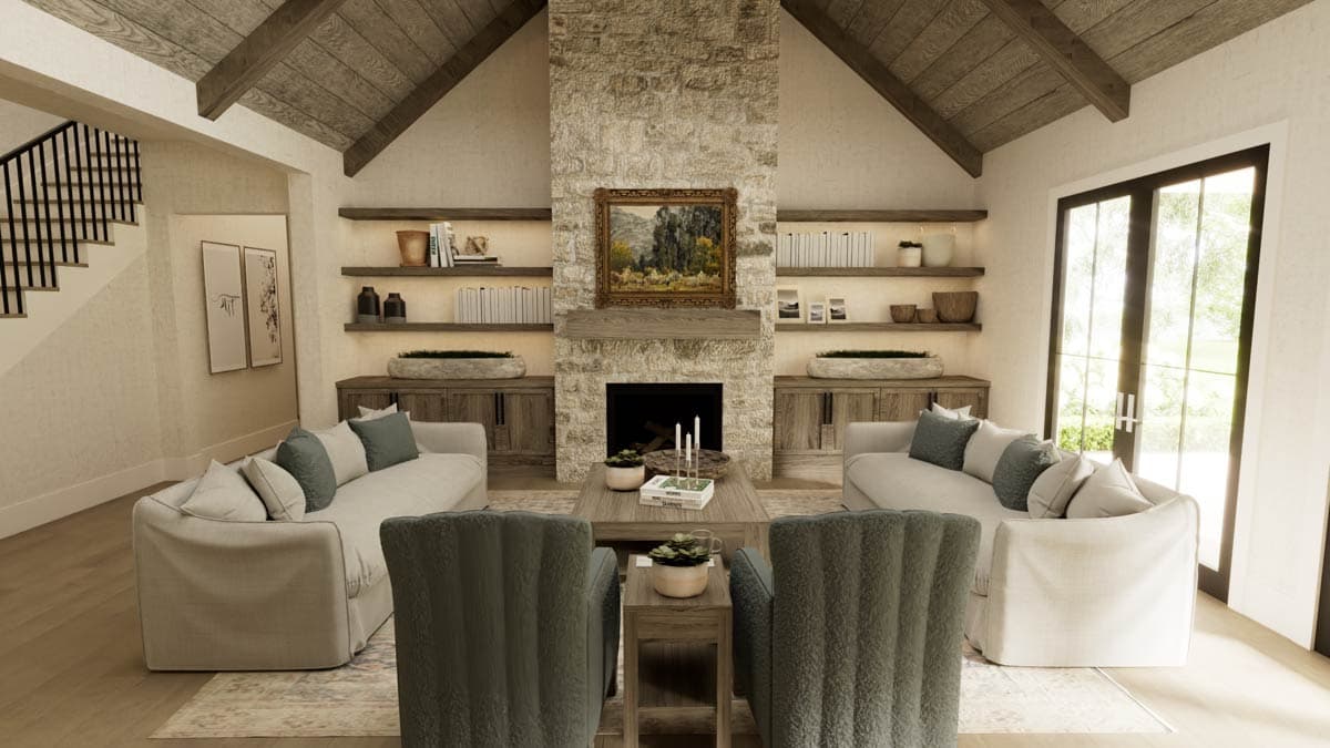
In Plan 820008WSF, deeper color is concentrated in the home office, giving that space a clear identity without carrying rich tones throughout the home. In the main living areas, built-ins and a wood ceiling introduce contrast in a way that adds depth while keeping the overall layout open and cohesive.
The key takeaway? Strong colors work best when the plan gives them a clear place to live. The full plan and interactive tour below show how these design choices play out across the home.
Loading plan...
Why Green Keeps Gaining Ground in Home Design
Green continues to trend because it bridges the gap between neutral and expressive. It feels grounded without being predictable, and it works across a
wide range of styles and settings.
In home design, green pairs naturally with indoor-outdoor living, abundant natural light, and materials like wood and stone. Whether it shows up inside or out, it complements architectural elements that emphasize connection to the landscape and a sense of continuity throughout the home.
Rather than feeling trendy, green reinforces a lasting connection to the outdoors. That makes it a natural fit for homes designed to prioritize light, views, and a comfortable flow between spaces.
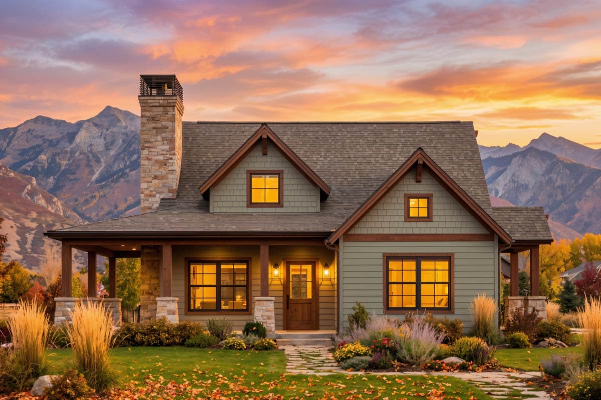
Plan 818193JSS - 3-Bedroom Mountain Country House Plan with Wrap-Around Porch
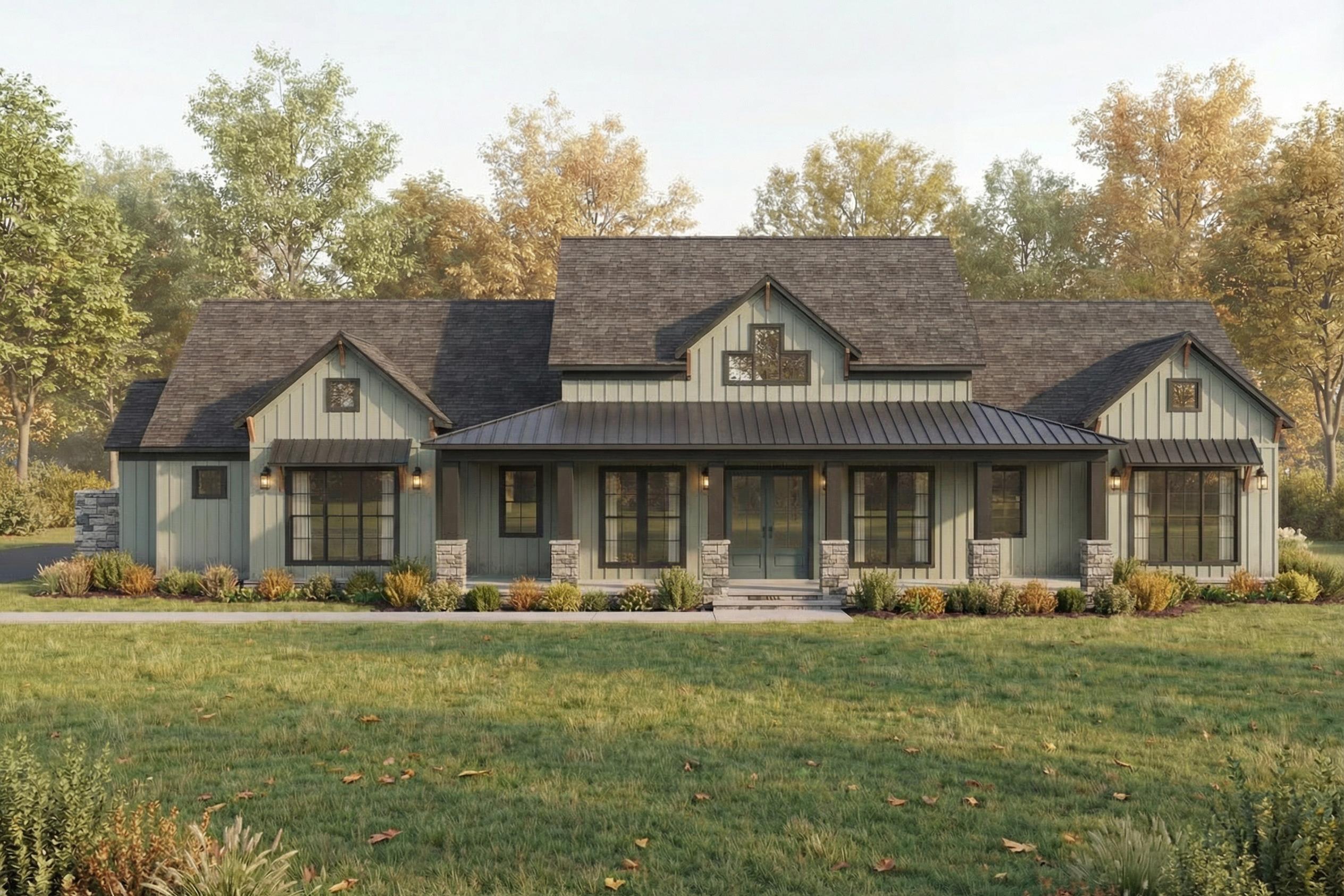
Plan 70947MK - Modern Farmhouse House Plan with 3-Car Garage and Outdoor Living
How to Think About Color Trends Without Dating Your Home
Color trends tend to work best when you see them as guidance, not instruction. The key isn’t choosing the “right” colors. It’s
choosing a house plan that can support change as your preferences evolve.
Plans with open layouts, clear sightlines, and strong natural light naturally support a wide range of palettes. They make it easier to update finishes or shift from lighter neutrals to deeper tones over time without the home feeling visually disjointed.
At the same time, well-designed floor plans balance openness with structure. Subtle transitions between spaces help stronger colors feel intentional and contained, which makes it easier to work with richer tones without letting them take over the entire home.
Design First. Color Second.
Paint can change over time. A good floor plan gives you flexibility.
As you explore
Architectural Designs' newest house plans, it helps to remember that color decisions don’t have to be final right away. Today’s color trends point to how people want their homes to feel—warm, balanced, and connected—but a well-designed plan gives you room to interpret those ideas in your own way.
Explore house plans designed to grow with you, and find a layout that feels right now and leaves plenty of room for what comes next.